A Universal Language
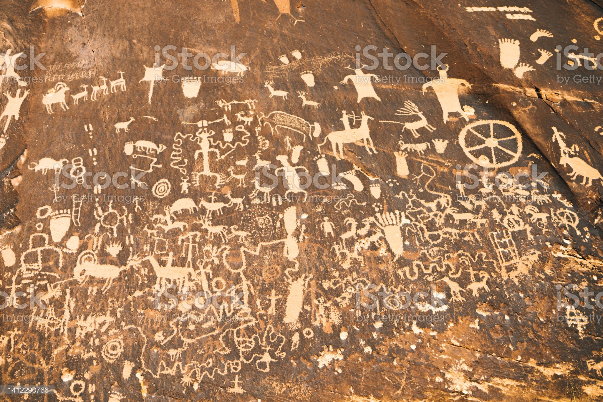
Ancient Petroglyphs – Nine Mile Canyon, Utah
Iconography and imagery have been used by humans for tens of thousands of years. Humans were using tools for cave drawings as early as 73,000 years ago according to a group of archaeologists, led by Christopher Henshilwood. Their findings were of a symbol resembling that of a modern-day hashtag. This finding was not unique, as many others have surfaced in different parts of the world, thousands of years apart. While neanderthals utilized crude tools such as hand-stencils, modern artists may utilize Adobe Creative Suite, Corel Painter, architects might use drafting software, physicians MRI imaging or X-Rays, and mechanical engineers might use computer-aided design software to design three-dimensional images of potential products.
We’ve all heard the expression “a picture is worth a thousand words”. The expression lends itself to our creativity, and to a different kind of stimulation that induces wonder. We are brought into a frame by the artist and free to let our brains work out the story surrounding that image might be. Images are also capable of transcending language barriers, and communicate with others despite not having the words to express it. A study conducted by Stacy Penalva and Cindy Bexler Borgmann, posted in an issue of Engage! A journal published by the University of Indiana’s IUPUI Office of Community Engagement, highlights the power of the imagery found in art to overcome language barriers. In this study, latino children were encouraged to model clay sculptures, titled “hanging journals” to describe themselves and their lives. What unfolded were their emotions, potential fears of deportation along with a strong sense of permanence of love for their families. One girl created a clay heart, which was meant to communicate the love for her mother, who unlike herself, is not a United States citizen. The fears and emotions felt by the little girl otherwise might’ve gone unnoticed if she was left to express them with writing or verbal communication alone.
A Brand Abroad
My wife and I are exhausted. We have embarked on an expedition of pure island beauty of the highest order in search of respite from our 9-5 prisons. Our honeymoon was rudely cut short by a jerk named Matthew. No, this wasn’t someone who cut me off in traffic, but a force of mother-nature named a Hurricane. This trip a year later was meant to one-up that honeymoon departure. The honeymoon was left short at only a day of fun in Charleston, South Carolina. We had to evacuate the city due to the natural disaster and were promptly rewarded with bumper-to-bumper break checking in the more-than-6-hour trek back to our home in northeast Georgia. A year later we found ourselves headed to Bora Bora, French Polynesia, but we were currently at the airport in Tahiti awaiting our connecting flight to the tiny airport in Bora Bora. We were terribly hungry, and searching for a bite to eat, when then I saw a familiar friend that is instantly recognizable. That my friends is the sign of two fried potatoes, curled over to form an “M”, the golden arches.
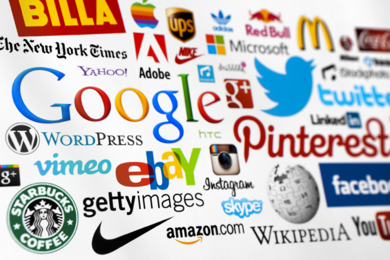
This realization, the feeling of familiarity when seeing McDonald’s signature logo, produced a kind of Pavlovian response to my taste for their french fries. The signature golden arches are a testament to graphic logos’ success in brand recognition. Controversial businessman Ray Kroc developed McDonald’s from the then small fast-food restaurant to a global franchise, with the golden arches a signature logo from the 1960’s onward. McDonald’s franchises now always utilize the golden arches at pretty much any McDonald’s location. While the color of the arches have been adjusted to match some area’s building codes, the arches can be seen in 120 countries around the world.
The signature shoe and clothing brand, Nike, also reaped the benefits of graphic design. The swoosh is instantly recognizable and used by professional sports teams the world over. Nike’s annual revenue is approximately $46.7 Billion dollars. A large part of their brand recognition started with the company paying a graphic arts student at Portland State reportedly $35 for the design of the logo. Another signature brand, revered by basketball fans and shoe collectors, owned by Nike is the Air Jordan brand. The iconic “Jumpman”, or “Air Jordan Wings” logo, created by Peter Moore, was from a photo shoot Michael Jordan participated in for the 1984 Summer Olympics.Nike’s name and it’s signature logo are based upon the Greek Goddess of “Winged Victory” representing success in art, music, war, and athletics.
The global success of McDonald’s and Nike cannot be separated from their unique graphic designs. One could argue that their success was not achievable on that scale without the use of graphic design to produce the swoosh, jumpman, and arches logos. Nike found global success and brand recognition through a $35 dollar investment that is now a $47 Billion dollar per-year powerhouse. It’s safe to say that investing in graphic design is well worth the investment, even if you aren’t juggernauts like McDonald’s and Nike. If you’re curious about the fate of that poor graphic arts student that produced the iconic swoosh, Phil Knight reported that the student was given 100 shares of Nike stock in 1980. The stock was valued at $22 per share at the time, it is now worth $110.39 as I’m typing this article here in 2023.
A Picture of Health
Imagine for a moment you are at a social gathering with friends. You enjoy a nice taco bar, equipped with beans, ground beef, chorizo, cheese, shredded lettuce sour cream, and all the fixings. Then, a couple of hours later you feel a burning sensation in your chest. You decide to head to your nearest convenience store to see what over-the-counter acid-reducers (reflux medications) they have available. You notice that one package states it is an acid reducer, but the logo has a cross-heir logo on it. You recognize the cross-heir being utilized on a number of pest control products. You decide to exercise better judgment and head to your local 24-hour pharmacy that is a little further away. There you see ole faithful, purple-and-yellow coloring and the recognizable Prilosec italicized and using that iconic block font. About 1 hour later you are sitting in your recliner at ease, not a care in the world and the previous discomfort nowhere to be found, you decide it is time for some ice cream.
The previous scenario highlights how brand recognition and how graphic design for a health product’s logo can influence a customer’s decision-making process. Nobody wants to see a cross-heir, or skull-and-crossbones on any prescription or OTC product used for their own health and well-being. They want to possibly see angelic wings, a glow around the font, a sense that help is on the way. While they certainly want to be ridden of the stomach acid, they don’t want the cure to be worse than the symptoms they are experiencing. The italicized block-font on the Prilosec text shows that the product means to spring into action. The fact it is italicized is also aesthetically pleasing. The border shape of the logo is an oval, spherical shapes and curves were also commonly used in the art-deco designs used in the 50’s for products and present a more inviting presence. The highlights of the shape have a glow surrounding it, resembling that of what you’d associate with relief or healing.
Humor can also be effectively used to promote healthcare brands. In the early 2000’s advertisements utilizing the tagline “Gotta Go, Gotta Go, Gotta Go Right Now” were utilized to market Detrol LA (tolterodine tartrate). Detrol LA is a treatment for patients suffering from an overactive bladder. Commercials demonstrated the urgency patients experienced in their everyday lives, such as a woman serving as a juror having to signal to an officer of the court her need to use the restroom in the middle of the trial. It utilized fast tempo music and humor in the beginning of the ad to demonstrate the annoyance of an overactive bladder and the urgent sensation to go that OAB causes. At the end of the ad, the tempo of the music is slowed and patients are indicating that Detrol LA has cured their symptoms. The tagline and lyrics of the music change to “And I don’t have to go right now”.
The urgency demonstrated in the popular TV ad’s present in the early 2000’s is also replicated in the Detrol LA logo. The logo shows a blue stick-like figure with their both hands raised and one leg seemingly in-motion. The logo represents the hurried nature of trying to locate the nearest restroom due to that certain urge that OAB patients experience.
Design that Evolves with You
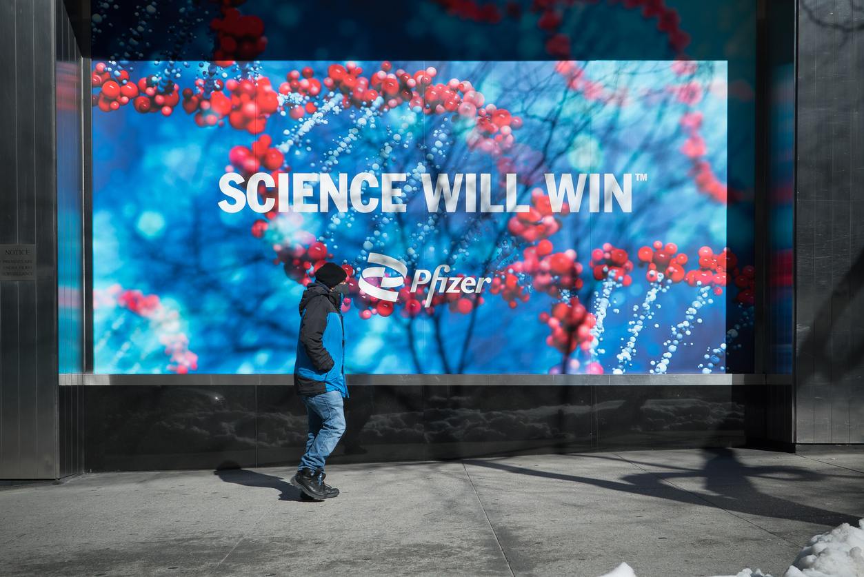
Manhattan, New York. Banner displaying new Pfizer double-helix logo.
It is important to structure your design around your company as it experiences changes and evolves. One company that experienced such an evolution was the pharmaceutical company, Pfizer. The onset of the COVID-19 pandemic was upon us and an unvaccinated world needed a remedy and quickly. In just nine months, Pfizer and BioNTech would develop the COVID-19 vaccine. With the successful production of the vaccine, Pfizer was no longer just a pharmaceutical company, they were also now committed to combating infectious diseases. And indeed, viewing Prizer’s clinical trials website would confirm this evolution, as trials for Coronavirus, Influenza, Lyme disease, Pneumococcal, RSV, Shingles, and Strep are listed for people to participate in.
Pfizer then got to work on a new logo that honors the past but also points to the future. The new logo presents a double-helix to represent DNA, but also represents an upward trajectory for continued progress, as the double-helix represents a ladder. The new design also features the same iconic italicized font and connected “f” to dot the “i”. It is important to rework your brand’s logo in times of change or shifts in priority to better market your company’s offerings as it evolves.
The Finale
Employing the use of good design is an excellent way to promote and grow your brand. Graphic design surpasses language barriers and succeeds as a method of marketing to diverse audiences around the world. The front-end investment associated with great design is typically offset as your brand and the logos associated with it pay for itself in the long-term. It is important that your logos and marketing materials speak to the audience’s needs. Finally, as your brand evolves, it is a great idea to revisit those designs to represent your updated service offerings. I will conclude this article with the following question: Does your logo adequately represent your brand?


Leave A Comment